
リストの書式
よく使うリストの表示形式をクラスの指定で実現できます。
- list-unstyledクラス
- ulに指定するとマーカーを表示しない。また、ulの左余白を0にする・・・サンプル
- list-inlineクラス
- ulやolに指定するとリストが横並びになる・・・サンプル
- Bootstrapのdl要素
- Bootstrapのdl要素の表示は通常のものと少し異なります・・・サンプル
- dl-horizontalクラス
- dlに指定するとdt要素とdd要素が横並びになる・・・サンプル
参考:リスト関連のBootstrapのCSSの内容は次のとおりです。
ul,
ol {
  margin-top: 0;
  margin-bottom: 10px;
}
ul ul,
ol ul,
ul ol,
ol ol {
  margin-bottom: 0;
}
.list-unstyled {
  padding-left: 0;
  list-style: none;
}
.list-inline {
  padding-left: 0;
  margin-left: -5px;
  list-style: none;
}
.list-inline > li {
  display: inline-block;
  padding-right: 5px;
  padding-left: 5px;
}
dl {
  margin-top: 0;
  margin-bottom: 20px;
}
dt,
dd {
  line-height: 1.42857143;
}
dt {
  font-weight: bold;
}
dd {
  margin-left: 0;
}
@media (min-width: 768px) {
  .dl-horizontal dt {
    float: left;
    width: 160px;
    overflow: hidden;
    clear: left;
    text-align: right;
    text-overflow: ellipsis;
    white-space: nowrap;
  }
  .dl-horizontal dd {
    margin-left: 180px;
  }
}
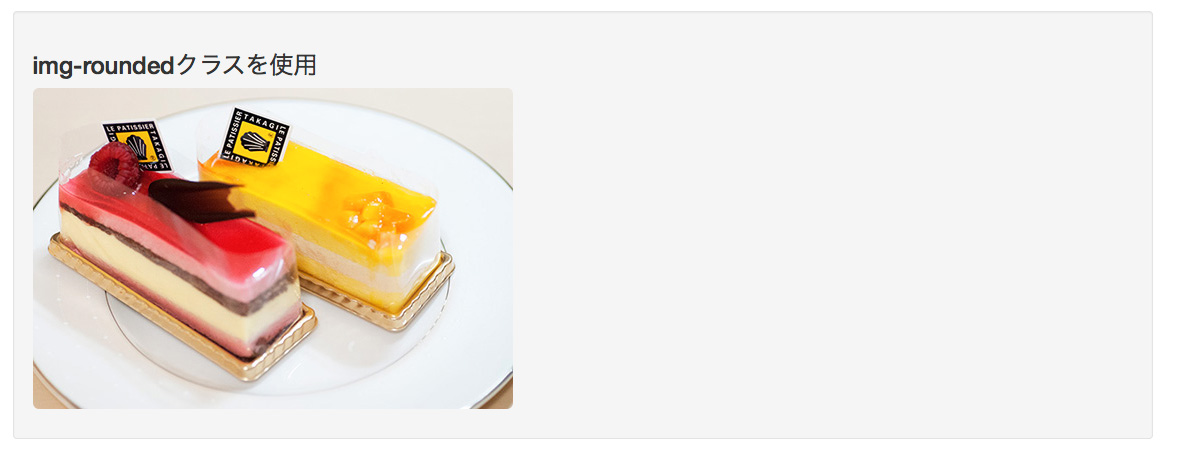
画像の形式
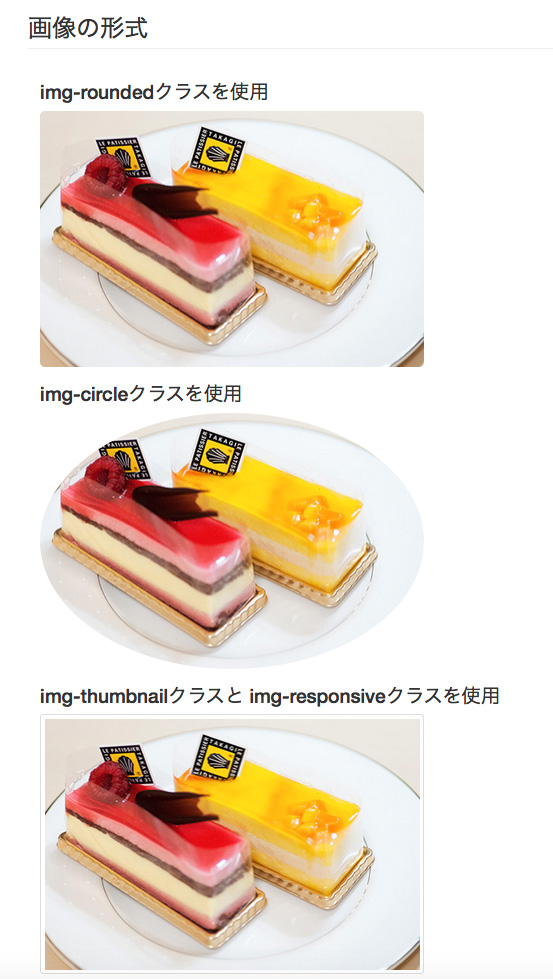
画像形式を設定するクラスのサンプル
3番目の画像にはimg-thumbnailとimg-responsiveクラスを設定しています。ブラウザの幅を狭くすると3番目の画像だけ縮小します。
1番目、2番目の画像にもimg-responsiveクラスを設置すると同様に縮小するようになります。
- img-round
- 画像を角丸四角形にします
- img-circle
- 画像を楕円形で表示します。正方形の画像は正円になります。
- img-thumbnail
- 画像の周囲を角丸の枠線で囲みます
- img-responsive
- 画像が親要素の縮小に伴って縮小します。拡大は実サイズ以上に拡大はしません
参考:画像関連のBootstrapのCSSの設定内容は次のとおりです。
img {
  vertical-align: middle;
}
.img-responsive,
.thumbnail > img,
.thumbnail a > img,
.carousel-inner > .item > img,
.carousel-inner > .item > a > img {
  display: block;
  max-width: 100%;
  height: auto;
}
.img-rounded {
  border-radius: 6px;
}
.img-thumbnail {
  display: inline-block;
  max-width: 100%;
  height: auto;
  padding: 4px;
  line-height: 1.42857143;
  background-color: #fff;
  border: 1px solid #ddd;
  border-radius: 4px;
  -webkit-transition: all .2s ease-in-out;
       -o-transition: all .2s ease-in-out;
          transition: all .2s ease-in-out;
}
.img-circle {
  border-radius: 50%;
}
ブロック要素の書式
Well
wellクラスを設定するとグレーの背景色で囲んだ囲み記事になります。
wellクラスのサンプル
参考:wellクラスのBootstrapのCSSの設定内容は次のとおりです。
.well {
  min-height: 20px;
  padding: 19px;
  margin-bottom: 20px;
  background-color: #f5f5f5;
  border: 1px solid #e3e3e3;
  border-radius: 4px;
  -webkit-box-shadow: inset 0 1px 1px rgba(0, 0, 0, .05);
          box-shadow: inset 0 1px 1px rgba(0, 0, 0, .05);
}
.well blockquote {
  border-color: #ddd;
  border-color: rgba(0, 0, 0, .15);
}
.well-lg {
  padding: 24px;
  border-radius: 6px;
}
.well-sm {
  padding: 9px;
  border-radius: 3px;
}
囲み記事
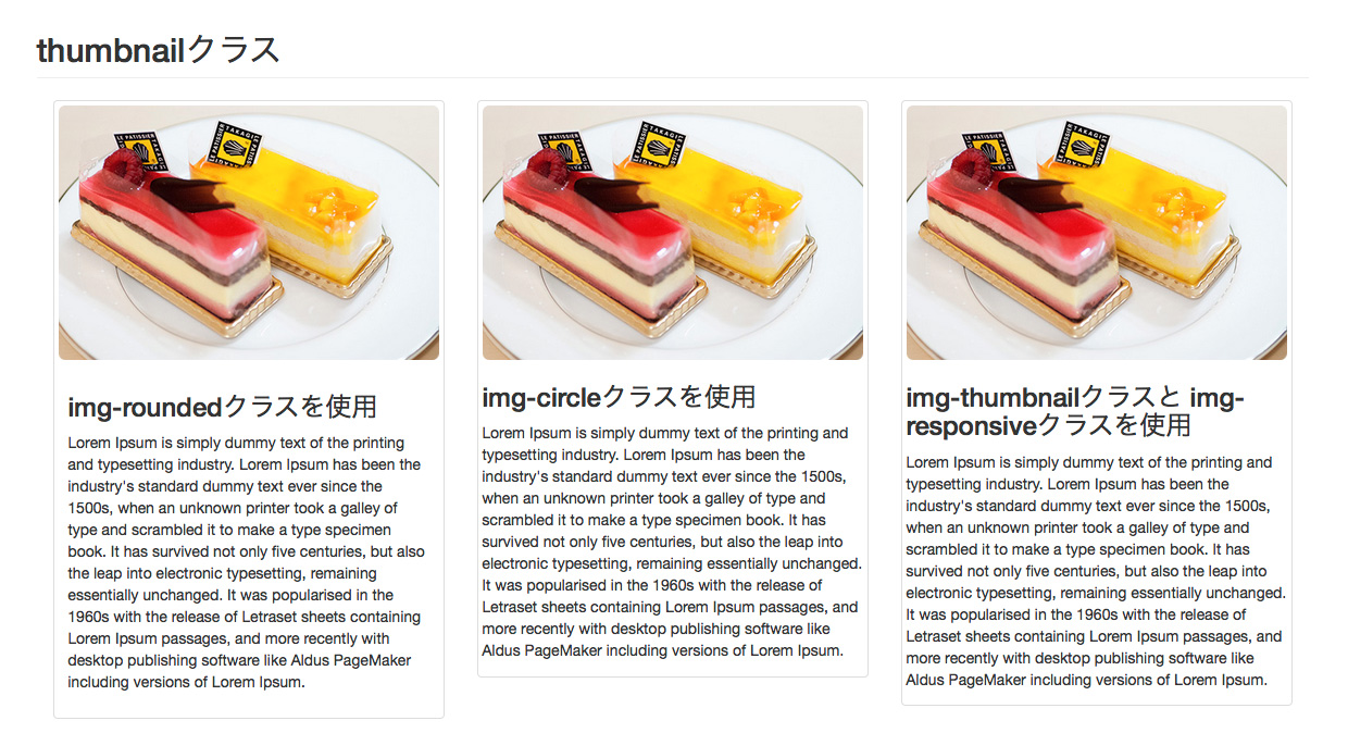
背景色で記事を囲むwellクラスと同様なものに、角丸の枠線で記事を囲むthumbnailクラスがあります。
このクラスのおもしろいところはthumbnailクラスで囲んだ記事の中にimg要素があると、img-responsiveクラスを使用しなくても画像がちょうど良い大きさに縮小してくれることです。ただし、thumbnailクラスの直接の子供として存在する必要があります。そのためimg要素をp要素などで囲むと縮小表示が適用されません。これはBootstrapのcss設定が.thumbnail > imgをセレクタとしてmax-width: 100%を設定しているからです。
thumbnailクラスで囲んだ記事のテキスト部分をcaptionクラスのdivで囲むことでテキスト部分の外側に余白が付けられます。
次のサンプルでは最初の囲み記事(いちばん左)にcaptionクラスを使用しています。残りのふたつと比較してみてください。
参考:thumbnailクラスのBootstrapのCSSの設定内容は次のとおりです。
.img-responsive,
.thumbnail > img,
.thumbnail a > img,
.carousel-inner > .item > img,
.carousel-inner > .item > a > img {
  display: block;
  max-width: 100%;
  height: auto;
}
.thumbnail {
  display: block;
  padding: 4px;
  margin-bottom: 20px;
  line-height: 1.42857143;
  background-color: #fff;
  border: 1px solid #ddd;
  border-radius: 4px;
  -webkit-transition: border .2s ease-in-out;
       -o-transition: border .2s ease-in-out;
          transition: border .2s ease-in-out;
}
.thumbnail > img,
.thumbnail a > img {
  margin-right: auto;
  margin-left: auto;
}
a.thumbnail:hover,
a.thumbnail:focus,
a.thumbnail.active {
  border-color: #428bca;
}
.thumbnail .caption {
  padding: 9px;
  color: #333;
}
参考:captionクラスのBootstrapのCSSの設定内容は次のとおりです。
.thumbnail .caption {
  padding: 9px;
  color: #333;
}
フロート
Bootstrapでフロートをかけたい時はクラス名で指定することができます。
pull-leftクラスのサンプル
- pull-leftクラス
- 左寄せをします。float:leftです。
- pull-rightクラス
- 右寄せします。float:rightです。
- clearfix
- 回り込みの解除。clearfixです。
clearfixクラスはフロートしたものの親要素に対して指定します。clearfixの使い方と同じです。
参考:pull-rightクラスとpull-leftクラスのBootstrapのCSSの設定内容は次のとおりです。
.pull-right {
  float: right !important;
}
.pull-left {
  float: left !important;
}
参考:clearfixクラスのBootstrapのCSSの設定内容は次のとおりです。
.clearfix:before,
.clearfix:after{
  display: table;
  content: " ";
}
.clearfix:after {
  clear: both;
}
ブロック要素を中央揃えにする方法
ブロック要素を中央揃えするには通常はmargin:autoを使用します。
Bootstrapにはcenter-blockクラスが用意されています。
参考:center-blockクラスのBootstrapのCSSの設定内容は次のとおりです。
.center-block {
  display: block;
  margin-right: auto;
  margin-left: auto;
}
コメントを投稿するにはログインしてください。